HEARTSTOPPER // NETFLIX
[Season 2 premiers on NETFLIX 3rd August 2023]
Bursting with paint bottles and stacked sketchbooks, our art classroom had walls adorned with students' work in various stages of progress. Charlie seeks refuge in this space, and so uncapped creativity was paramount to the comfort he feels here. Utilizing recycled materials, we created charismatic displays of self-discovery, nature, and identity through color, sculpture, and fine art mediums.
Textured glass objects and high-gloss surfaces bounce light from the windows, creating soft focus interest for the camera. Charlie and Nick's blossoming attraction is paralleled with elements on the set that bloom into life. Cacti grow flowers, nurtured plants sprawl, and wall displays become more radiant as our story shifts from winter to spring.
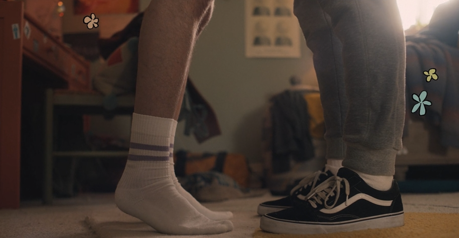
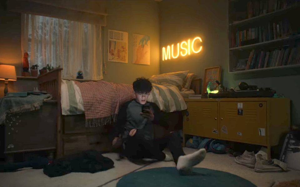
We wanted the bedrooms to look as if they had accumulated with the characters over time. Detailing in unexpected ways, we repurposed objects and layered dressing to authentically style a "lived-in" quality to our sets. Littered smalls detailed exploration, curiosity, and imagination for each character in contrasting ways. Height marks notched on bedroom doors and threadbare childhood teddies collide with trinkets from family holidays and doodles of future-bound affirmations. We repeated hand-drawn motifs across textiles and ceramics to pay homage to the project's roots matched by animation in the edit.
Rich collections of curated props immersed us in a familiar, slouchy aesthetic with momentum. The intensity of dressing ebbs and flows with the storyline, increasingly becoming more cluttered in pinch points of emotion. Model airplanes soaring towards windows and toy soldiers climbing up shelves to freedom echo the concept that our teenage characters are being catapulted into their prime.
I am the Set Decorator of the BAFTA nominated and Emmy Award Winning ‘Heartstopper’ for Netflix . Working with designers Tim Dickel (s1) and Carys Beard (s2), we crafted a world based on the Graphic Novels that inspired the series.
Oseman's works, from acclaimed black and white graphic novels to a celebratory technicolour 8-part teen drama, required us to craft a heightened visual for the complex and confident teen escapism that Heartstopper champions. Inspired by the source material, our zingy sorbet palate uses acidic yellows to slice through sky blues in our school sets, while our domestic scenes feature calmer undertones of burnt oranges and soft green hues. Our rhythmic colour control grounded a considered graphic aesthetic that gained momentum and scale as our story developed.
Truham School is the tapestry where our characters encounter significant challenges and moral dilemmas. We worked to install refreshing blocks of colour throughout the sets, interjected with large-scale painted murals inspired by the style of Oseman's work. A turbulent painted wave mural sets the pace in a busy hallway, and large-scale graphic abstract outlines of walking legs set the backdrop for a gossip-filled lunch on the school field.
In the Truham Form Room, we explored geology using the earthy side of our palette. We designed notice boards with concentric topographical line work and placed a collection of handmade volcano sculptures to emulate the pent-up pressure of school and relationships. We applied annotated acetate prints of crystal formations across the windows to offer a dynamic sense of discovery. Working with the knowledge that rocks are formed under pressure, we hint at a parable for when Charlie and Nick's romance ignites in the classroom.